Innovative design...
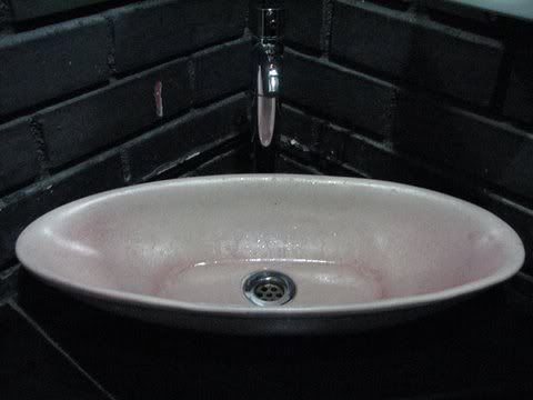
I do like to see good design, especially when it is done to surpass disadvantages. At Nani Auditorium, I went to the ladies’ restroom; it’s a tiny place, and the architect had severe space restrictions. So I was impressed to see this design for the wash basin:
What normally happens when one washes one’s hands and face, is that the water goes down one’s elbows and drips on to the floor. The elongated design of this basin makes sure that the water from the elbows also falls into the basin, not outside.
The basin also makes use of the restricted space in the corner of the wash area very well.
But while on the topic of wash basins, I can’t call it good design when the basins are raised above the counter level. My idea of good design would be a basin sunk into the counter, so that spilt water can easily go back into the basin without having to be specifically dried or wiped. Surprising how often I find basins raised above the counter-top, though!

